As I’ve analyzed thousands of pages using the Chrome User Experience Report (CrUX) and HTTP Archive, I’ve realized that “slow” isn’t a single state. It’s a set of distinct behaviors, and the reason for the slowness can vary. A site struggling with JavaScript bloat on a high-end device in New York behaves fundamentally differently than a lightweight site crippled by a slow network in a rural area.
I wanted to understand these relationships more from a web platform perspective, and in this article, I use a machine learning approach called clustering to classify and identify patterns in web performance and page composition.
The dataset
Much of machine learning and data science involves cleaning and preparing the data. Fortunately, I did this before when I wrote a previous article on web performance and machine learning. The data originated from the HTTPArchive and the CrUX API, and I was able to reuse the same dataset from my previous article to do this exploration as well.
What is clustering?
Clustering is a technique used to group similar data points into distinct groups. Items in the same cluster or group are more similar to each other than items in different clusters. If you’ve ever done a card sorting exercise, that is a manual clustering exercise where you put things into groups based on their similarity.
In machine learning, clustering is done programmatically using algorithms like K-Means. After running the clustering algorithms, we’re left with groups of items that have common characteristics or patterns.
Standardizing Features and Running K-Means
One consideration for using a clustering algorithm is determining how many clusters are ideal. Fortunately, there are methods that we can use to programmatically identify that as well. In this data exploration, I used the elbow method to determine the optimal number of clusters. Using this method, the largest bend in the curve will indicate a good starting point for the ideal number of clusters.
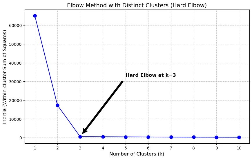
In some cases, you get a hard elbow where the ideal number of clusters is easily identified by a significant bend in the visualization:
When I ran the elbow method over this dataset, I got a more gradual curve where the elbow wasn’t as pronounced:
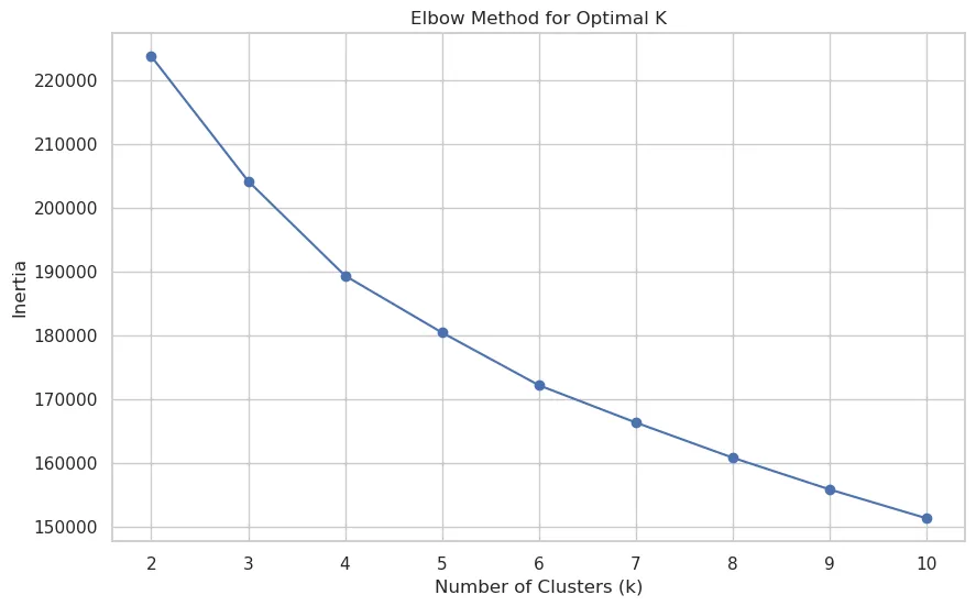
However, even with this gradual curve, I could (barely) see that four clusters would be a good number to fit the final model.
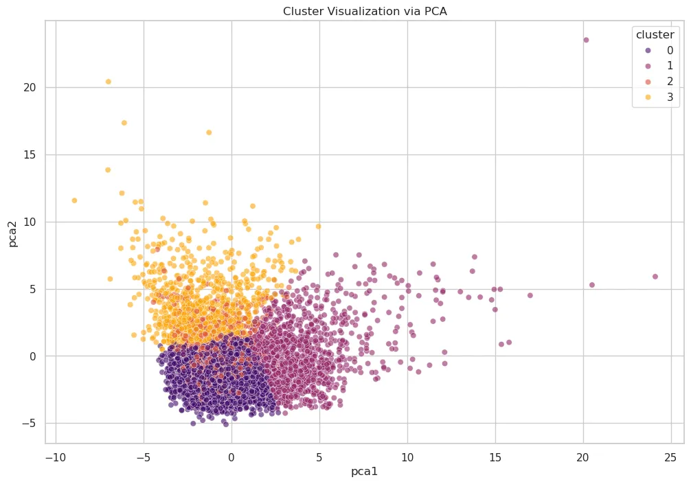
Cluster Visualization
Once the number of clusters is determined, I can use PCA to project the high-dimensional feature space into 2D.
What we can see is three very distinct clusters, and one that is a bit fuzzy (cluster 1) because it is interspersed with other clusters.
Interpreting the Clusters
To understand the clusters, we examine the average values for key features within each group. This is where my domain expertise in web performance comes into play. After analyzing trends in each cluster, here’s what I noticed:
- Cluster 0 - (Field-Optimized / Image-Heavy Stable Pages): This is the strongest-performing and largest cluster. It has the best field outcomes overall. These pages have the highest ratio of images relative to the total bytes on the page (
img_bytes_ratio~0.384). However, both lab and field performance are under control, suggesting efficient delivery despite visual richness. - Cluster 1 - (Field-Limited / High-Variability Pages): This cluster stands out as the weakest in field performance. It also shows extreme spread and outliers, with large max values in both
fcp_p75andlcp_p75, indicating a highly unstable group. While its JS volume is not the highest in absolute bytes, this cluster appears most constrained by real-user conditions and variability. - Cluster 2 - (JS/CSS Heavier but Borderline-Good Field Performance): This group is more resource-heavy than cluster 0 and has the highest
js_bytes_ratio~0.471. Despite this, its field performance is comparatively better than cluster 1. Its LCP (lcp_p75~2453ms) is barely inside the “good” range, and TTFB (ttfb_p75~900ms) is barely outside the good range. It looks like a “heavier but still mostly controlled” cluster rather than a latency-dominated one. - Cluster 3 - (Extreme Lab Slowdowns / Heavy Pages with Layout Instability): This cluster has the worst lab metrics. It also has the largest page weight in JS (
bytesJS~2.49M) and images (bytesImg~2.84M) and the worst visual stability (cls_p75~0.172) and interaction metrics (inp_p75~297ms). Interestingly, its average field LCP (lcp_p75~2546ms) is worse than cluster 0 and 2 but still better than cluster 1, which suggests severe synthetic bottlenecks without being the single worst real-user cluster.
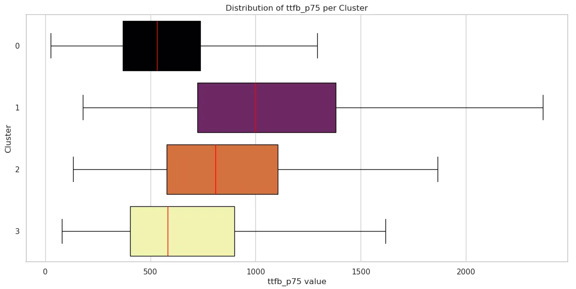
Cluster Field Metrics Box Plots
We can visualize the distribution of field performance metrics for each cluster to see how the data is distributed. If you’re not familiar with box plots, they are a visual depiction of how data is spread out. They show the median, quartiles, and statistically relevant range of data. Box plots are useful for comparing distributions between different clusters and identifying any outliers or unusual data points. This is a good article that explains how to interpret box plots.
Time to First Byte (TTFB)
| Cluster 0 | Cluster 1 | Cluster 2 | Cluster 3 | |
|---|---|---|---|---|
| mean | 590.539227 | 1116.870712 | 900.138824 | 720.670179 |
| std | 319.969492 | 597.812687 | 492.832707 | 510.239135 |
| min | 26 | 178 | 133 | 79 |
| 25% | 368 | 723 | 577.5 | 404 |
| 50% | 530 | 999 | 809.5 | 581 |
| 75% | 738 | 1382 | 1106 | 899 |
| max | 3534 | 5634 | 4010 | 5320 |
First Contentful Paint (FCP)
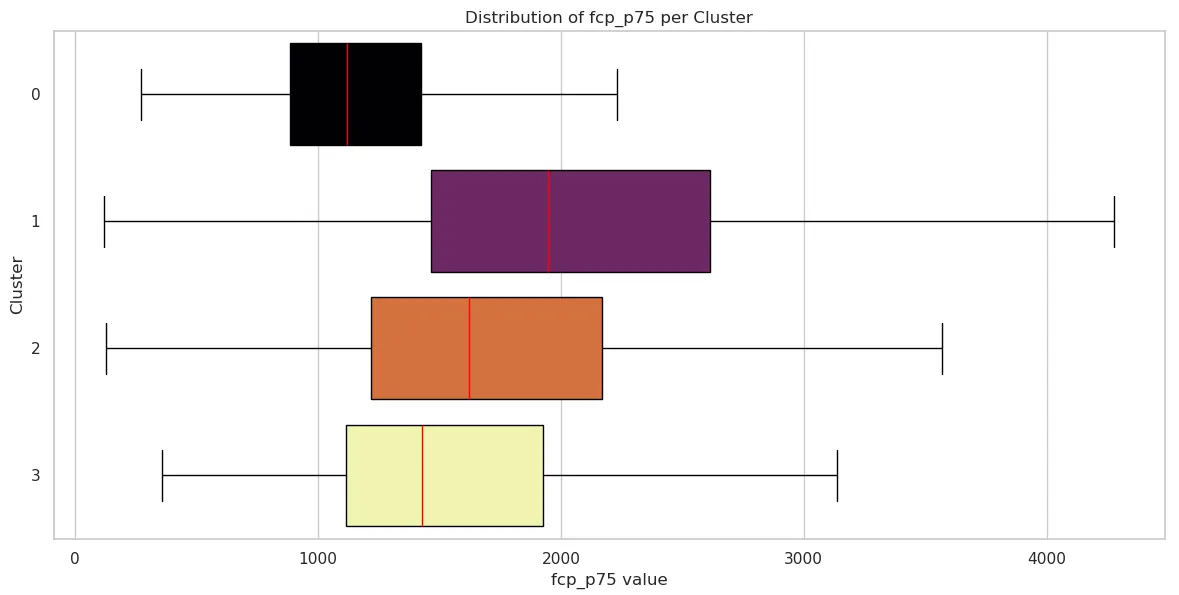
| Cluster 0 | Cluster 1 | Cluster 2 | Cluster 3 | |
|---|---|---|---|---|
| mean | 1197.729430 | 2395.493404 | 1869.784706 | 1643.468915 |
| std | 511.756519 | 4612.853907 | 1042.555435 | 898.762398 |
| min | 272 | 119 | 128 | 357 |
| 25% | 884 | 1464 | 1219.75 | 1114 |
| 50% | 1118 | 1946 | 1623 | 1430 |
| 75% | 1425 | 2615 | 2170.25 | 1928 |
| max | 11425 | 150590 | 9101 | 9751 |
Largest Contentful Paint (LCP)
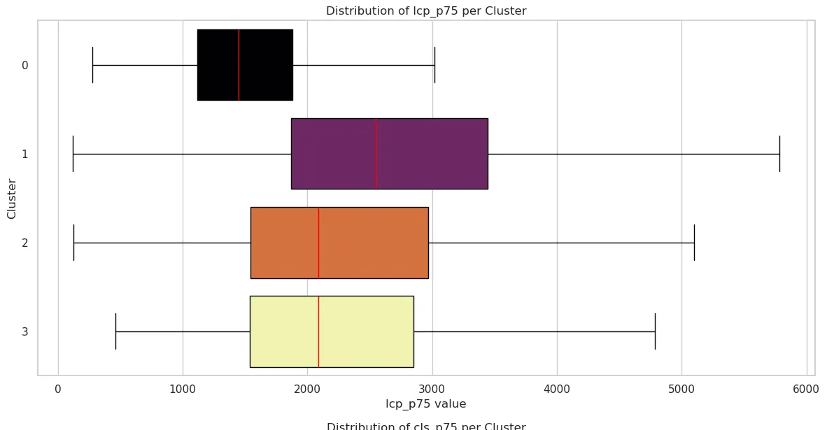
| Cluster 0 | Cluster 1 | Cluster 2 | Cluster 3 | |
|---|---|---|---|---|
| mean | 1578.041332 | 3094.496922 | 2453.036471 | 2545.781876 |
| std | 717.992229 | 5181.459280 | 1456.467192 | 1794.159260 |
| min | 275 | 119 | 122 | 459 |
| 25% | 1118 | 1870 | 1543.75 | 1539 |
| 50% | 1450 | 2545 | 2085 | 2087 |
| 75% | 1880 | 3446 | 2967 | 2853 |
| max | 11979 | 167042 | 13850 | 18442 |
Cumulative Layout Shift (CLS)
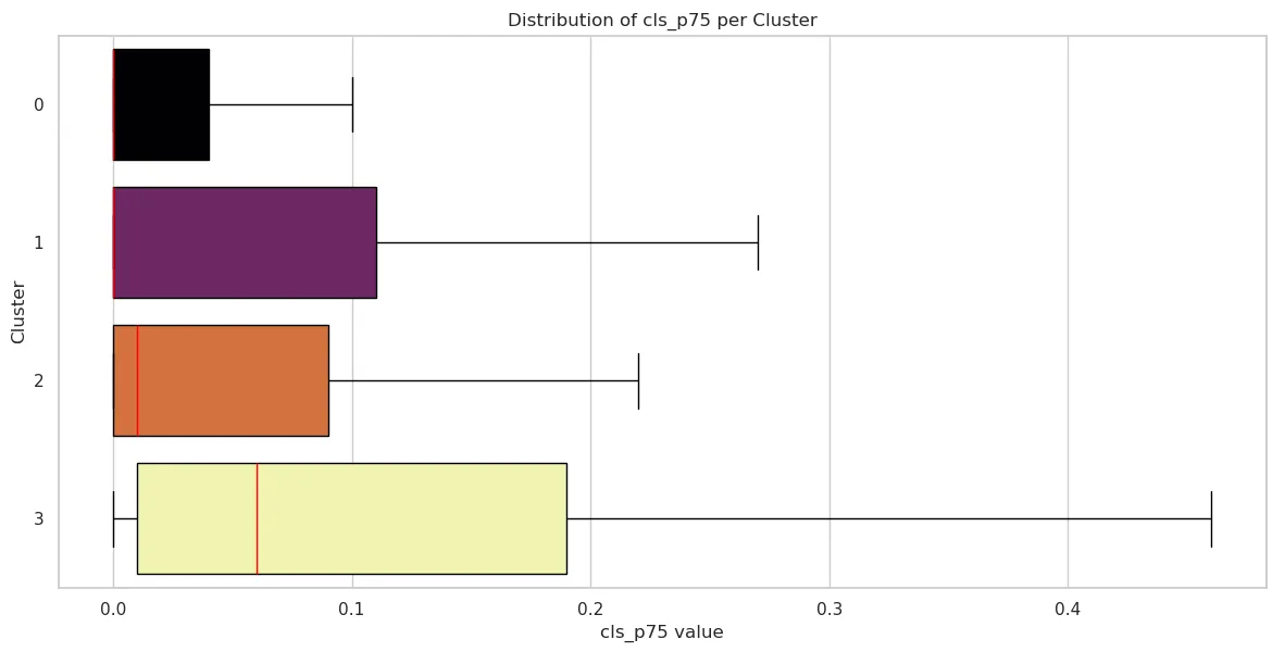
| Cluster 0 | Cluster 1 | Cluster 2 | Cluster 3 | |
|---|---|---|---|---|
| mean | 0.053291 | 0.113615 | 0.079871 | 0.172276 |
| std | 0.136675 | 0.243097 | 0.162854 | 0.290943 |
| min | 0 | 0 | 0 | 0 |
| 25% | 0 | 0 | 0 | 0.01 |
| 50% | 0 | 0 | 0.01 | 0.06 |
| 75% | 0.04 | 0.11 | 0.09 | 0.19 |
| max | 1.4 | 2.11 | 1.35 | 2.08 |
Interaction to Next Paint (INP)
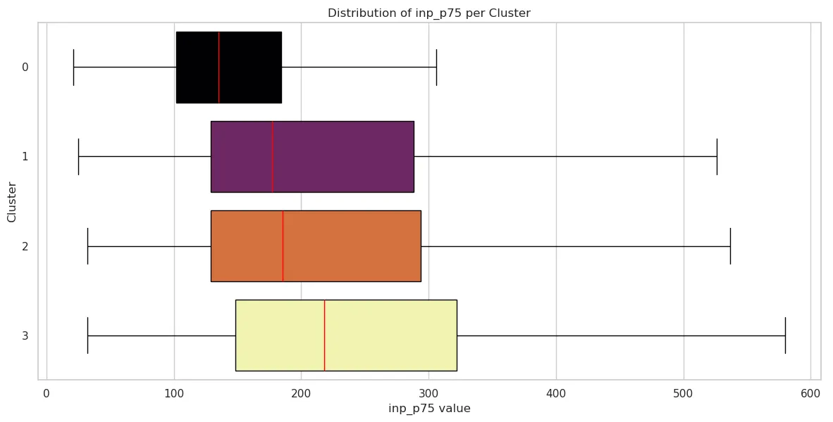
| Cluster 0 | Cluster 1 | Cluster 2 | Cluster 3 | |
|---|---|---|---|---|
| mean | 160.638729 | 272.205805 | 243.747059 | 296.781876 |
| std | 109.736882 | 297.494588 | 197.992875 | 286.211224 |
| min | 21 | 25 | 32 | 32 |
| 25% | 102 | 129 | 129 | 148 |
| 50% | 135 | 177 | 185.5 | 218 |
| 75% | 184 | 288 | 294 | 322 |
| max | 2200 | 4214 | 2335 | 2962 |
Conclusion: Beyond “Fast” and “Slow”
By applying clustering to field and lab data, we move beyond the reductive binary of “fast” versus “slow.” This analysis reveals that web performance is a landscape of distinct archetypes, each with its own technical constraints and user experience realities.
Whether a site falls into the Field-Optimized stability of Cluster 0 or the Extreme Lab Slowdown of Cluster 3, the data shows that “page weight” is not destiny. High-performing pages can still be visually rich, and lightweight pages can still be crippled by field variability and network latency.
For developers and stakeholders, these clusters provide a roadmap for optimization:
- Identify your archetype: Are you struggling with JavaScript execution (Cluster 2) or environmental instability (Cluster 1)?
- Prioritize the right metrics: cluster your own data and fix the pages at the intersection of the worst performance and the most traffic.
- Bridge the Lab-Field Gap: Understanding why some sites perform well in tests but fail in the field (and vice versa) is the key to building resilient digital experiences.
Ultimately, machine learning allows us to see the signatures of performance at scale. By recognizing these patterns, we can stop chasing scores and start solving the specific architectural problems that stand between our users and a seamless experience.