One of the most frequent accessibility problems I encounter is inadequate color contrast. It happens for a variety of reasons, but fortunately it is one of the easiest to address. I recently started working on a new design system at my full time employer, and I wanted to make choosing color combinations easy by putting contrast measurements inside the design system documentation.
The working environment
Sometimes the development team is asked to implement designs that come from designers or third parties who handle overflow work. It’s important for the development team to be able to point to a specific guideline if colors diverge from our system, if there are different fonts, or if the spacing breaks out of its normal baseline rhythm. This helps the UI stay consistent, but it also helps cut down on the CSS needed to implement a design.
Style Dictionary
A key part of the design system is providing all the style tokens in a central location. Currently, this is done using Style Dictionary, although I’m keeping an eye on the design token format that is in draft status with the W3C. Defining the design tokens in a central location allows them to be exported into various formats like JSON, SCSS, and CSS so they can be used by developers and designers alike.
Here is an excerpt of the color ramp for “blue” as defined in Style Dictionary. By convention, the colors always get darker as the number increases.
{
  "blue": {
    "10": {
      "value": "oklch(97.76% 0.011 234.81)"
    },
    "20": {
      "value": "oklch(95.02% 0.022 239.43)"
    },
    "30": {
      "value": "oklch(89.46% 0.048 235.66)"
    },
    "40": {
      "value": "oklch(81.31% 0.088 233.46)"
    },
    "50": {
      "value": "oklch(72.49% 0.124 234.49)"
    },
    "60": {
      "value": "oklch(64.92% 0.135 237.98)"
    }
  }
}
When built, there will be separate files for each output type defined in the Style Dictionary config. You’ll have a file of CSS variables with names like --color-blue-10, --color-blue-20, --color-blue-30, etc. In our case, similar files are produced for SCSS and JSON. The output variables can be optionally prefixed to avoid conflicts with tokens from other sources. I kept it short here for this article.
Inside the build script, a filter is registered that is used to pull out a list of colors.
// build.js
const StyleDictionary = require("style-dictionary");

StyleDictionary.registerFilter({
  name: "is-color",
  matcher: (token) => {
    const colors = [
      "red",
      "green",
      "blue",
      "black",
      "white",
      "gray" /*, blah, blah, blah */,
    ];
    return colors.includes(token.attributes.category);
  },
});

const StyleDictionaryExtended = StyleDictionary.extend("config.json");

// FINALLY, BUILD ALL THE PLATFORMS
StyleDictionaryExtended.buildAllPlatforms();
The relevant part of the configuration is below for the JSON output. This will write a flat file, and it references the filter defined in build.js above, so it only contains color tokens and not ones for fonts or sizing.
{
  "source": ["tokens/**/*.json"],
  "platforms": {
    "json": {
      "buildPath": "dist/json/",
      "transformGroup": "css",
      "files": [
        {
          "destination": "colors.js",
          "format": "json/flat",
          "filter": "is-color"
        }
      ]
    }
  }
}
Color space
As you might notice, the colors are defined using the OKLCH color space. Since this is a greenfield system, OKLCH gets first class support since it is compatible with display-p3, which will only continue to grow in popularity over time. Browser support for OKLCH sits right around 85% at this time this article was written, but that will continue to trend toward 100% as time goes on. We can provide a fallback at build time with postcss-oklab-function.
Accessibility concerns
Unfortunately, the color contrast accessibility tools have not caught up with the new color spaces and device capabilities. All requirements for WCAG compliance are reliant upon relative luminance, and the formula to calculate it assumes the sRGB color space. Even the working group for WCAG 3 does not make mention of the success criteria for sufficient contrast of these newly-possible colors on their wiki at the time of this writing.
For the time being, that leaves us with relying on fallback colors to assure compliance with WCAG. If you dip into colors that are outside the sRGB color space (e.g. Rec2020 or p3), I suggest leaving a bit of a buffer to ensure compliance on all devices in the future. In other words, calculate accessibility for WCAG with the hexadecimal fallback colors, but make sure it exceeds a 4.5:1 ratio for AA compliance. 5:1 seems to be a good place to be.
Example
oklch(0.4901 0.24 23.23) is in the p3 color space. It does not exist in sRGB, but it will fallback to #bd0019. The contrast ratio between #ffffff and #bd0019 is 6.6:1, so that should work fine, regardless of whether the user is on a p3-capable display or not.
White text on oklch(0.4901 0.24 23.23)
Publishing
The colors file above isn’t that useful unless it can be imported by other packages. Treating internal packages as if they were external dependencies is essential if you want to reuse code across projects.
To accomplish this, I set up our environment to publish scoped packages (e.g. packages prefixed with @myscope) to AWS CodeArtifact. That way, we can keep closed source packages out of the npm registry but version them and use a package manager like npm to install them as if they were public, open source packages.
I set up our CI/CD to pull the assets from CodeArtifact as well, so “it just works” from the standpoint of developers who are using these dependencies and don’t touch the infrastructure. The only dependency is that they need to set up AWS CLI since it’s used to issue an authentication token for the CodeArtifact repository.
Documentation
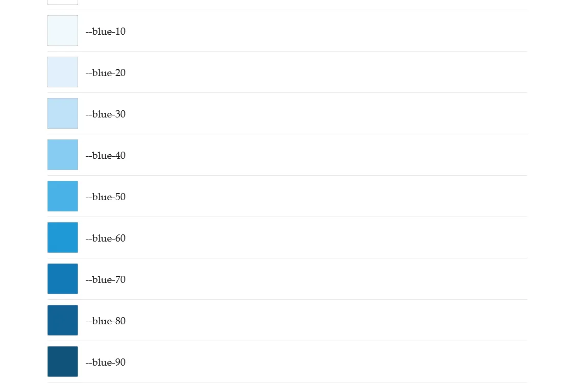
There are about 100 colors per brand when you factor in the entire color ramp of brand colors, accent colors, and colors that indicate state for buttons actions or notification messages like confirm, delete, warning, etc.
Because I published the tokens to CodeArtifact, I can bring them in as a dependency for our documentation and produce a list of swatches from the JSON output of Style Dictionary like the screenshot below.
Using colorjs.io, I built a web component to measure the contrast between two colors. This component can live inside the design system documentation or any other page we want to use it on.
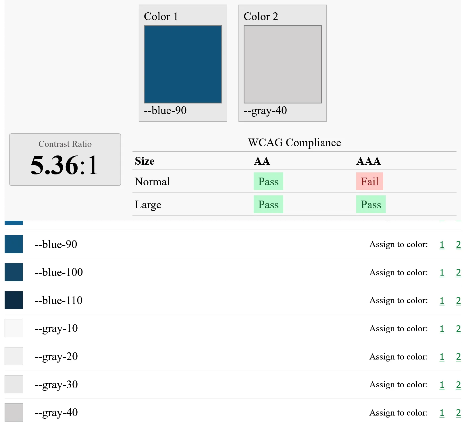
The web component allows the selection of the design system swatches and color contrast is computed on the fly, along with pass/fail criteria for WCAG AA and AAA.
Conclusion
I know there are a bevy of contrast checking tools already out there, but creating one that can live inside the documentation for the design system makes the accessibility requirement very apparent and is helpful in the long term.