I saw a comment from Igor Gonak on LinkedIn asking others if their design system components used ShadowDOM or the LightDOM. I thought it might be useful to explain my thinking in long form.
LightDOM can be great in some cases, but for something like a design system that others are consuming downstream, I’m more likely to use ShadowDOM.
One of the benefits of using ShadowDOM is that the styles are encapsulated and scoped to the component. This is often one of the biggest sources of confusion for developers since it can be difficult to understand how styles are applied, but it really is a robust system once you get the hang of it.
To allow for maximum flexibility, the primary interface for styling components is a robust system of design tokens that are provided in the form of CSS custom properties (aka CSS variables).
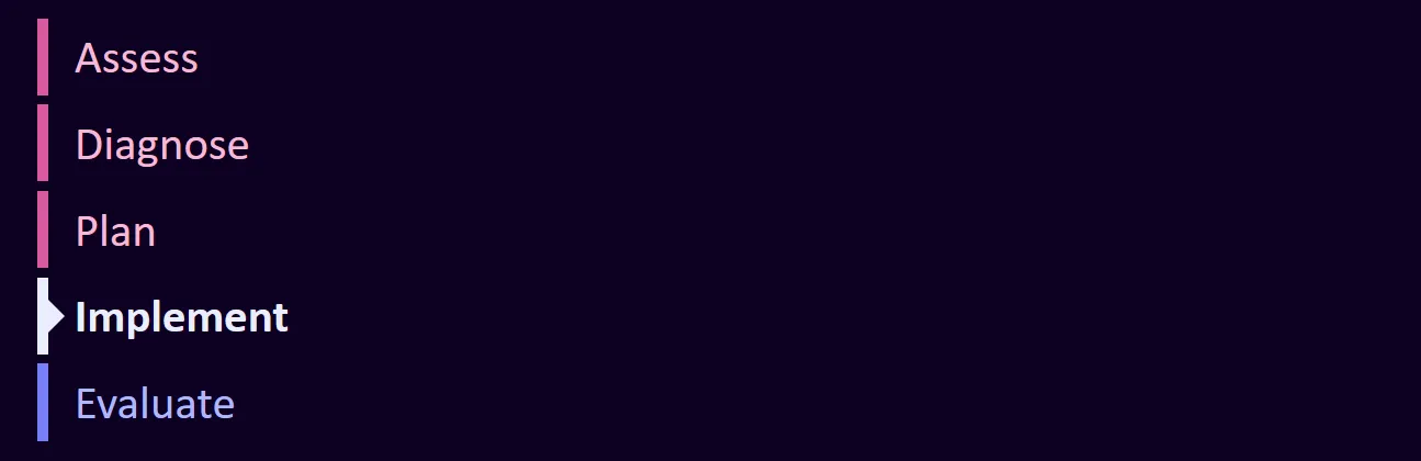
These tokens help provide a solid set of default styles, but give developers a way to customize a UI so the components fit into a broader context. Today, I’ll walk through an example of a step indicator component that is used to walk a user through a series of sequential actions or steps. Think of it like a progress bar with named steps.
Code for this component is available on GitHub. I recorded a video that walks you through it, and the main concepts are explained in written form below.
Watch on YouTube.
Fitting into a system
From my perspective, a good design system starts with a foundation, which is often a set of system-level tokens that provide a consistent visual language for the components throughout the system. This includes a range of colors, spacing, and typography. For system tokens, I like the following naming convention as described by Nathan Curtis, --{namespace}-{category}-{property}-{family}-{value}. That means, I might have color token values like --eg-system-color-neutral-10 and --eg-system-color-neutral-90 for colors and sizes like --eg-system-size-2 and --eg-system-size-12.
Theme tokens
The system tokens are a list of possible values, but they aren’t always the easiest to work with. For example, if you wanted to have a consistent property for padding that can be used across the system, you might be tempted to use a single token like --eg-system-size-20, but then you would have to remember the exact value for any component you wanted to use it in.
For that reason, it’s often easier to have a set of theme tokens with memorable names that are aliases for the system tokens. For example, you might have some theme tokens that provide various, deliberately constrained options for margins and padding that can be used throughout an application.
:root {
  --eg-theme-spacing-md: var(--eg-system-size-20);
  --eg-theme-spacing-mdlg: var(--eg-system-size-24);
  --eg-theme-spacing-lg: var(--eg-system-size-32);
}
Component tokens
Now that you have a set of theme tokens, you can use them to create component tokens that provide the specific values for a component. These public component tokens are named like --eg-c-step-indicator-color-border-active and --eg-c-step-indicator-item-marker-size. These names are more verbose, but I usually make internal aliases with shorter names inside the component to reduce the typing and cognitive load of developing the component. These are prefixed with an _ and are considered private by naming convention.
These component tokens can even reference other component tokens as seen in the example below.
:host {
  --_border-color-default: var(--eg-c-step-indicator-color-border-default, var(--_color-default));
  --_color-default: var(--eg-c-step-indicator-color-default, hsl(0 0 0));
}
This says that the default border color is the same as the default text color unless the developer wishes to override it. Furthermore, we set the default text color to black unless the developer wants to change it.
Out of the box, both the text color and the border color are black, but the way we set this up allows them to be changed independently. If you want to change the text color to hotpink, add a custom property for it:
:root {
  --eg-c-step-indicator-color-default: hotpink;
}
Similarly, if you want to change the border color to blue as well, you can do so:
:root {
  --eg-c-step-indicator-color-border-default: blue;
  --eg-c-step-indicator-color-default: hotpink;
}
With a robust set of tokens, developers can customize the look and feel of components, and the authors of the design system can say what should and shouldn’t be customizable. CSS custom properties can pierce through the ShadowDOM, but most CSS properties cannot.
Conclusion
I hope this post has helped you understand my approach to structuring components when working with the ShadowDOM in a design system. If you have questions or need help with your own design system, feel free to reach out.