In part one of this series, I talked about how I justified the need for a new design system by documenting inconsistencies throughout our product, demonstrating the cost and risk of said inconsistencies, and showing how a proper design system could help produce work quicker.
This post covers requirements and planning of the system itself.
Different brands with individual personalities
My employer has 5 distinct brands, each with their own personality. 4 of the 5 brands still publish a print magazine, and there is an effort to carry over some of the visuals to the digital space. The personality is reflected in its visual elements, such as colors, fonts, and buttons, but the themeable components can be limited to a select few items.
For instance, buttons should be themeable components, but error messages should look the same across all the brands. Tabs should be themeable, but modals should not. The icon set can (and should) all be the same, so that a search icon on one site is exactly the same as a search icon on the rest of the sites, and for the love of all that is holy, there do not need to be multiple variations of the search icon on a site. Furthermore, the components should only vary visually; behaviorally, they should all be the same.
That means the API, properties, and events should be the same and the components should behave consistently.
It would be great if we could develop the components and easily preview them under different themes.
Based on that, we know what the desired output is:
- Ability to preview themes for each component
- Markup consistency between brands (i.e. no forks of components)
- Document behavior for events, API, and options
- Document theming, variables, parts, and slots
- Ability to export the system as a library to be used in other products
- Able to be used in a server-side rendered application in the PHP ecosystem
The last two bullet points dictated the technology for the design system itself. We went with web components and used Lit for the interactive components, while some of the foundational components are built with composable CSS classes so they can be used in the light DOM and shadow DOM.
We considered using another technology like Vue, React, and Svelte. Ultimately, web components provided easiest integration point and smallest footprint in our multi-page apps.
Storybook
There are several tools that satisfy the requirements in the desired output above, but Storybook seemed to be the best option for us. We liked that it offered a great ecosystem, it was free, and it natively supported web components. It also has a useful showcase of design systems and thorough documentation.
Planning what goes into the system
Planning what goes into the system can be a time-consuming effort. It usually involves taking an inventory of all the variants of a specific component. In our case, we decided to take a gradual approach to rolling out components, so taking inventory was also an exercise in finding elements that either had the most variations (it was buttons) or components that we used in a variety of places with few variations but might take a long time to develop (drawers and dropdown menus).
When I took Nathan Curtis' workshop last year, he suggested that anything that is used in more than 3 locations should be added to the design system, and I think this is great advice.
The most common elements in our case were:
- Accordions
- Avatars
- Buttons
- Cards
- Carousels
- Dropdowns
- Drawers
- Expandables
- Grids
- Headings
- Modals
- Tabs
Gradual introduction
The plan for rollout was to add components to the design system and absorb the development time for the components as part of the scope of new projects. The first project required a dropdown, buttons, and a drawer menu.
The system is versioned with semver, so each introduction of a new component that did not exist before was designed to be a minor version bump.
Expanding on style tokens
To make the theming happen, we expanded on the foundational style tokens we set up before. The foundational tokens are considered brand and component agnostic. They map to specific properties --tau-size-10 is always 0.25rem regardless of the brand. The token values are directional in nature, so as the number suffix gets larger, the sizes get bigger and colors get darker.
Other non-foundational tokens are brand specific, such as primary, secondary, and accent colors. Style dictionary provides an example of how to set up a multi-brand token configuration that was a helpful reference.
The component-specific tokens are simply references to either the brand-specific or foundational tokens. They do not introduce new values. For instance, the tokens that control the button border and border-radius reference foundational tokens:
{
  "size": {
    "border": {
      "radius": {
        "button": {
          "md": {
            "value": "{radius.size.20}"
          }
        }
      },
      "button": {
        "value": "{border.size.20}"
      }
    }
  }
}
However, the colors for the button reference the brand-specific tokens. Here is one brand that has a green button at rest.
{
  "color": {
    "background": {
      "button": {
        "primary": {
          "rest": {
            "value": "{color.green.40.value}"
          }
        }
      }
    }
  }
}
And here is a different brand that has an orange button at rest.
{
  "color": {
    "background": {
      "button": {
        "primary": {
          "rest": {
            "value": "{color.orange.40.value}"
          }
        }
      }
    }
  }
}
While this will add a little size to the CSS output, it will help tremendously with maintainability and reuse, so the tradeoff will be worth it in the end.
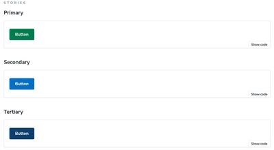
Button example
A button is a fundamental component for user interaction, and based on the usage throughout our products, it was the first component to go into the system. Since we're treating the design system as a dependency used on multiple brands, it needed to be flexible enough to fulfill most of the use cases that were previously in our product. The nice part about Storybook is that these variants can map directly to a "story," so you can make sure each use case is covered.
Tag support
The "button" component needed to look the same if it was a <button> or an <a> tag, even though they are semantically different.
Color variants
- Primary, secondary, and tertiary solid color variants used for calls-to-action
- A solid border variant with transparent background
- A bare-bones variety that looks like a hyperlink
- User action variants like "confirm" and "delete"
Button content
The button can accommodate multiple slots for content:
- Text only buttons
- Icon only buttons
- Rounded
- Rectangle with rounded borders
- Text + icon buttons
- Icon before the text
- Icon after the text
- Icon both before and after the text
Size variants
Buttons can come in small, medium, or large sizes.
Dropdown example
The dropdown is used in our application to navigate or filter within a section. The dropdown component uses the button component to trigger a menu that is able to be positioned either above or below the button. There are fewer variants than with the button, but the interaction is more complex.
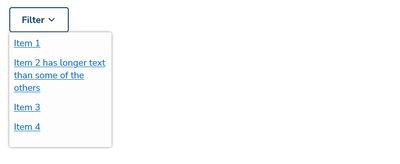
The interaction is built into the component. The functional requirements are as follows:
- Contain 2 slots; 1 for the trigger button and 1 for the menu.
- Trap focus with the tab key when the menu is open so the options are keyboard navigable.
- Can be closed with the escape key.
- Selecting a menu item fires a
selectedevent. - Fires events when the menu is opened or closed.
- Can be styled with CSS properties.
Conclusion
All the use cases dictate the stories that need to be written and what needs to be tested. We now have a solid foundation to build upon that is flexible enough to keep the stakeholders at the various brands happy but also provides the reusability that allows developers to be productive while focusing our level of risk and testing down to the component level.