Update 22 Sept 2022: I wrote this article back in 2009 and took it down when I switched focus in my career from design to development. A fair amount of people linked to it and used it in the classroom, so I decided to put it back up and update it, even if it's not my focus anymore.
Color properties and their application
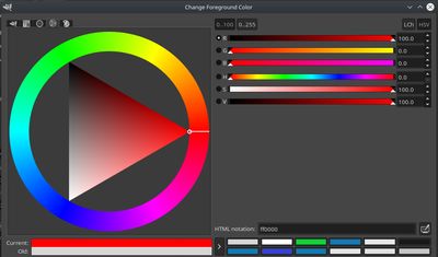
When this article was written back in 2009, nearly all web designers used either RGB or Hexadecimal color values. Tools like Photoshop offered other color spaces like Hue, Saturation, and Value (HSV) and LAB color, but it wasn't common to refer to colors this way.
Now, it's possible to work natively with hue, saturation, and lightness (HSL) values in the browser, and doing so can provide a more intuitive means of working with color since it's easier to visualize on the color wheel this way.
Hue
Hue is the name of a pure color. A hue is indicated by its position (in degrees) on the color wheel. The higher the slider on the color bar goes, the further around the color wheel you go.
Saturation
Saturation is the intensity or dullness of a hue. A fully saturated hue has a value of 100%.
Lightness
Lightness is a visual perception of the luminance. Luminance is a difficult thing to understand, so it helps to simplify it into a familiar reference point. White has a lightness value of 100%, neutral is 50%, and black has a lightness value of 0%.
Understanding the color wheel and color harmony
The color wheel is the most important tool to understanding color harmony. Position on the color wheel is indicated by degrees. Every color harmony will have a base hue to serve as the common element between other colors.
To come up with color schemes, start with your base color indicated by H0 in the examples below, and perform a simple calculation using the provided formulas.
Complementary
A complementary color scheme is a two-color combination consisting of a base color (H0) and another color (H1) that is 180 degrees apart from H0 on the color wheel.
- formula: H1 = |(H0 + 180 degrees) - 360 degrees|
Split-complementary
A split-complementary color scheme is a three-color combination that consists of a base color (H0) and two colors (H1 and H2) that are 150 degrees and 210 degrees apart from H0 respectively.
- formula: H1 = |(H0 + 150 degrees) - 360 degrees|
- formula: H2 = |(H0 + 210 degrees) - 360 degrees|
Triadic
This is a three-color combination that consists of a base color (H0) and two colors (H1 and H2) that are 120 degrees and 240 degrees apart from H0 respectively.
- formula: H1 = |(H0 + 120 degrees) - 360 degrees|
- formula: H2 = |(H0 + 240 degrees) - 360 degrees|
Tetradic
A four-color combination that consists of a base color (H0) and three colors (H1, H2, and H3) that are 90 degrees, 180 degrees, and 270 degrees apart from H0 respectively.
- formula: H1 = |(H0 + 90 degrees) - 360 degrees|
- formula: H2 = |(H0 + 180 degrees) - 360 degrees|
- formula: H3 = |(H0 + 270 degrees) - 360 degrees|
Analagous
Analagous color schemes use a combination consisting of a base color (H0) and one or more adjacent colors (30 degrees apart) on the color wheel.
- formula: H1 = |(H0 + 30 degrees) - 360 degrees|
- formula: H2 = |(H0 + 60 degrees) - 360 degrees|
- formula: H3 = |(H0 + 90 degrees) - 360 degrees|
Monochrome
A Monochrome color scheme is where all colors are derived from the base color and the hue value is not changed. Variations are achieved by changing the S-value and/or the L-value for your base color.
Putting it together
As a practical example, I am going to walk you through the creation of a split-complementary color scheme. To get started, I am going to work with a base color with a hue value of 256. This is H0 and will serve as the anchor point for our color scheme.
- H0: hsl(256, 80%, 55%)
- H1: hsl(46, 14%, 88%)
- H2: hsl(106, 94%, 72%)
These colors use strict adherence to the formula, but it would be pretty boring to only use 3 colors. For a nice selection of colors, we can take these 3 colors and manipulate the saturation and/or lightness values. That should give you plenty to work with, and these colors can be used as a guideline for anything that might appear on a site.
- H0: hsl(256, 80%, 55%)
- hsl(256, 50%, 55%)
- hsl(256, 50%, 55%)
- hsl(256, 20%, 35%)
- H1: hsl(46, 14%, 88%)
- hsl(46, 24%, 78%)
- hsl(46, 34%, 68%)
- hsl(46, 18%, 4%)
- H2: hsl(106, 94%, 72%)
- hsl(106, 94%, 52%)
- hsl(106, 94%, 32%)
- hsl(106, 10%, 50%)
Notice that in some of these swatches, both the saturation and lightness values were changed, but in other cases, only 1 parameter was altered. You're free to do whatever you want, and you're guaranteed to get something that works if you take this approach.